1_1 Poster Design – Lawrence of Arabia
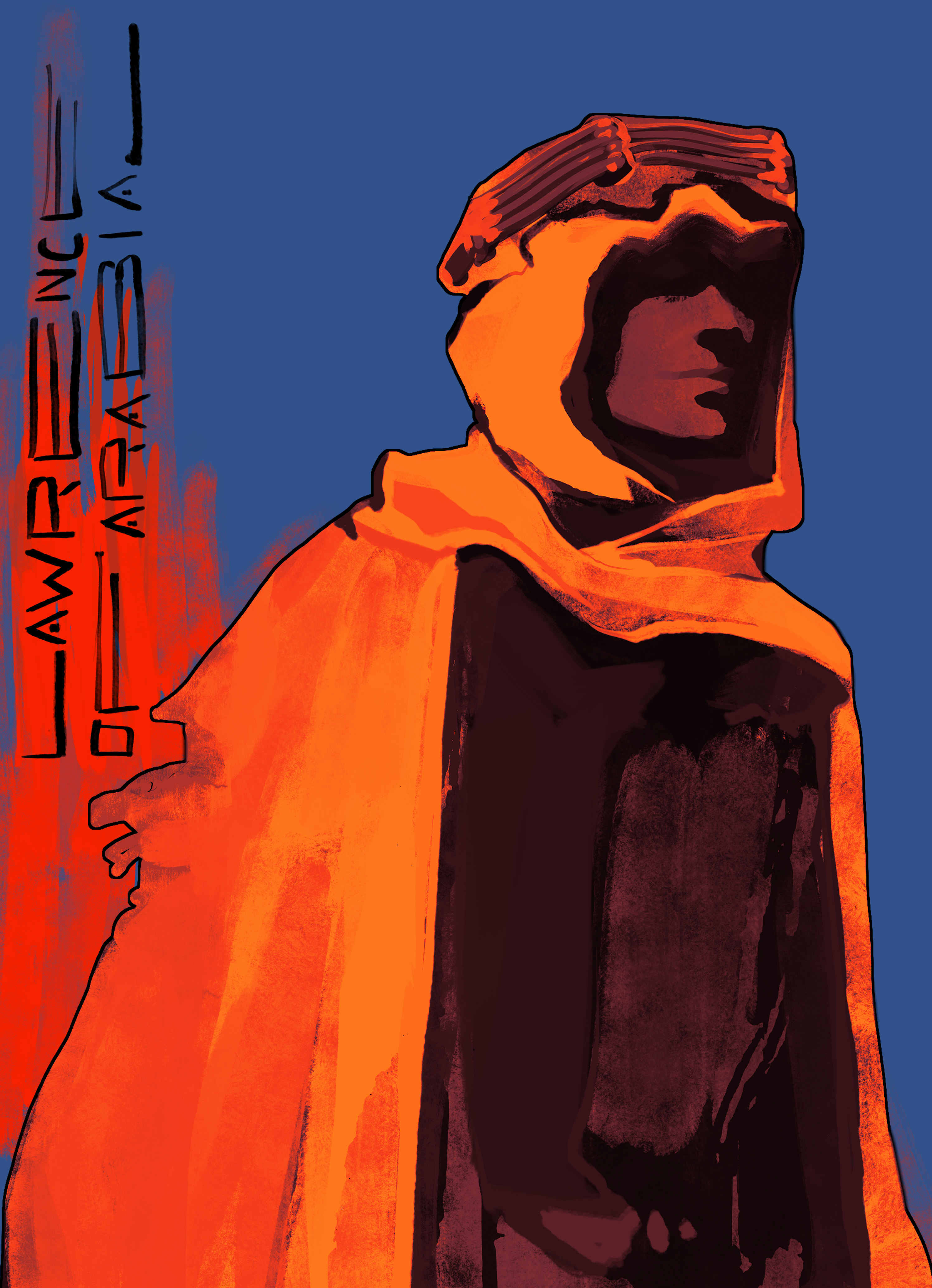
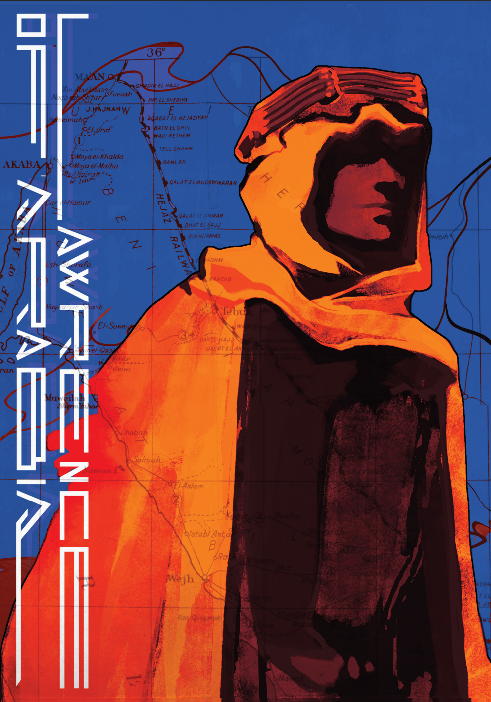
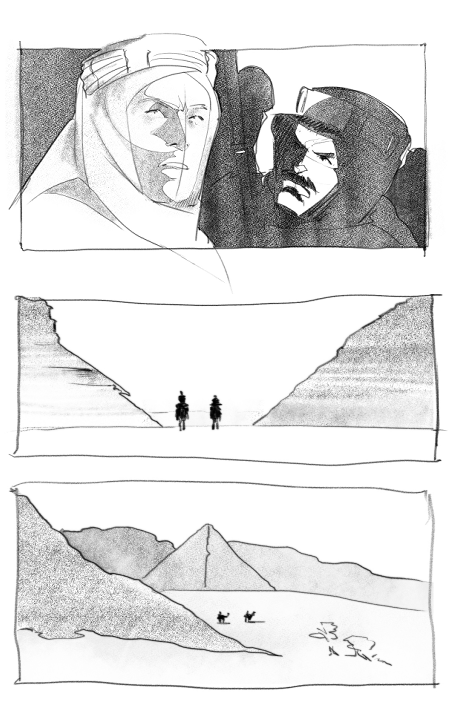
Lawrence of Arabia (1962) is an epic biographical adventure directed by David Lean. As part of a collaboration with the NoMAD Movie Art collective, students were invited to reinterpret cult-classic film posters in their own distinctive styles.
Drawing inspiration from hand-illustrated posters of the era,my approach prioritized texture and atmospheric composition. I aimed to create a powerful visual draw, using contrast and color to conjure the intensity and heat of the Arabian desert. (first and final version)
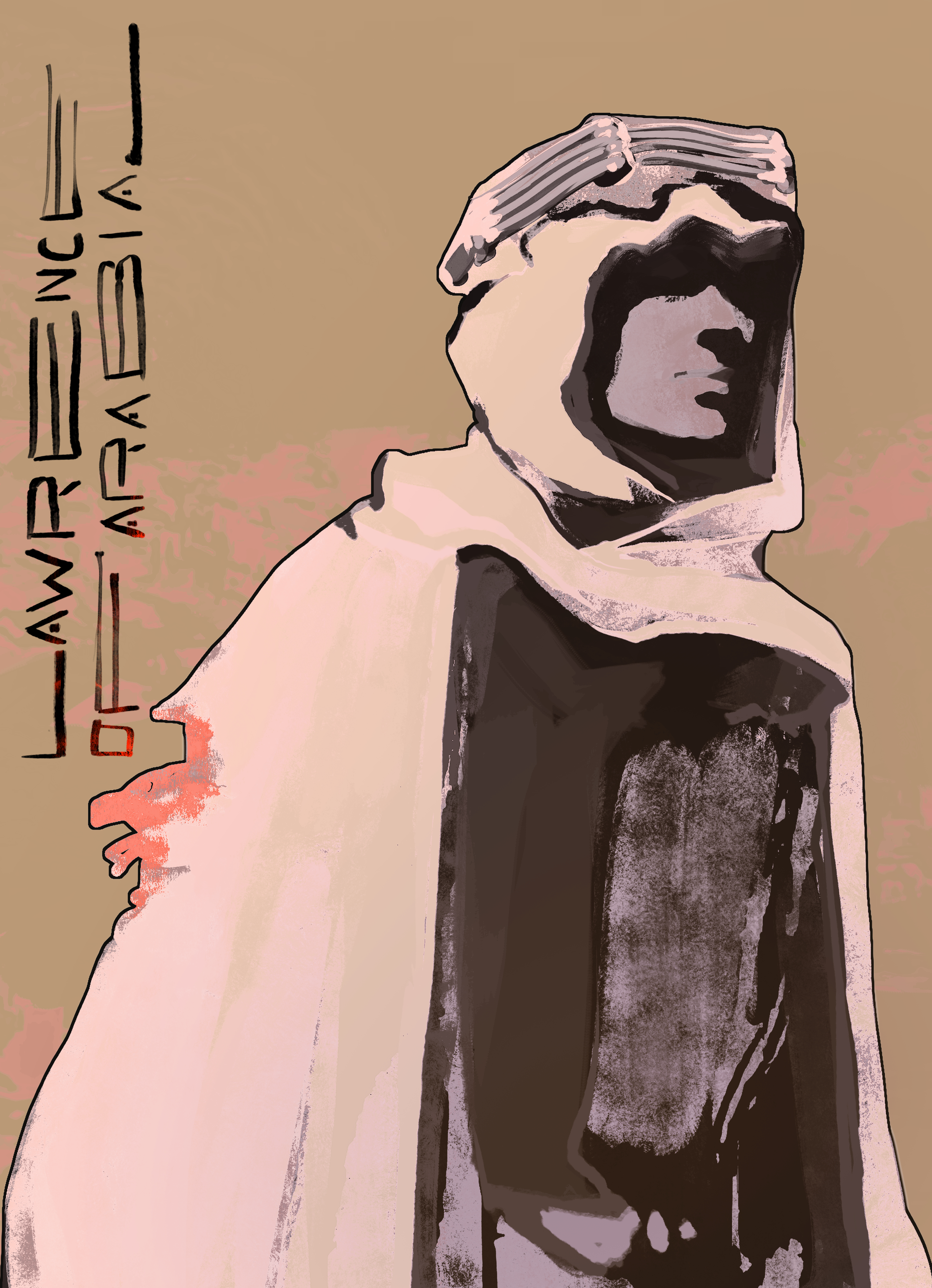
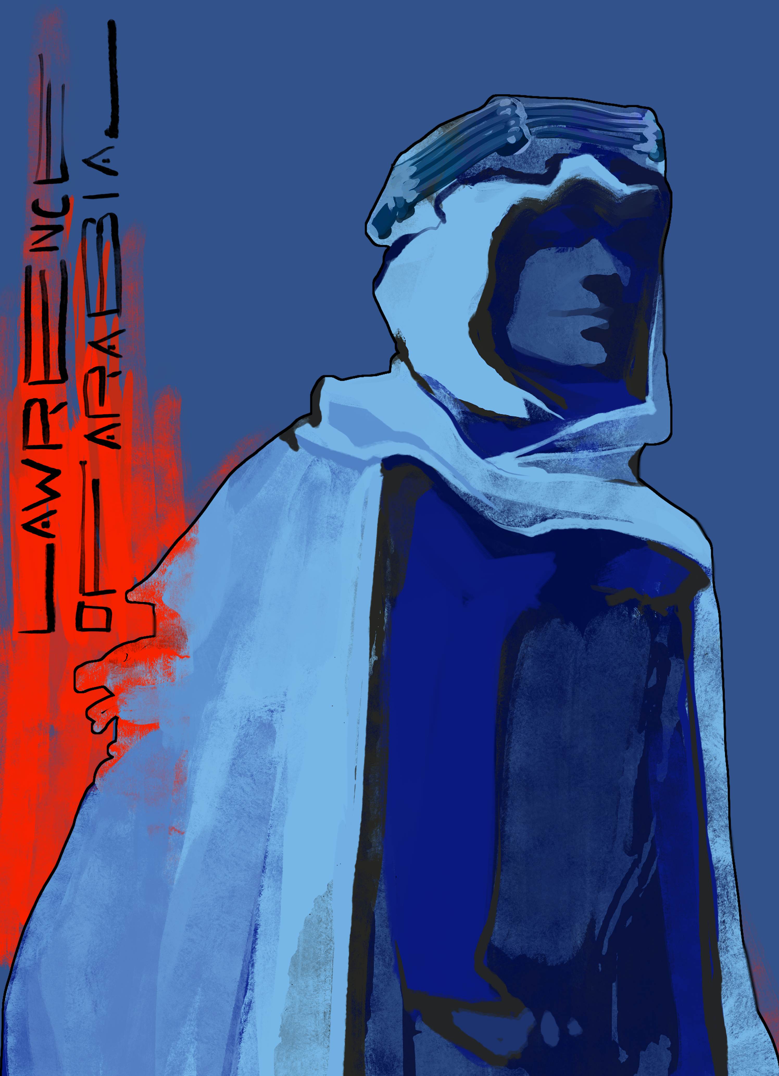

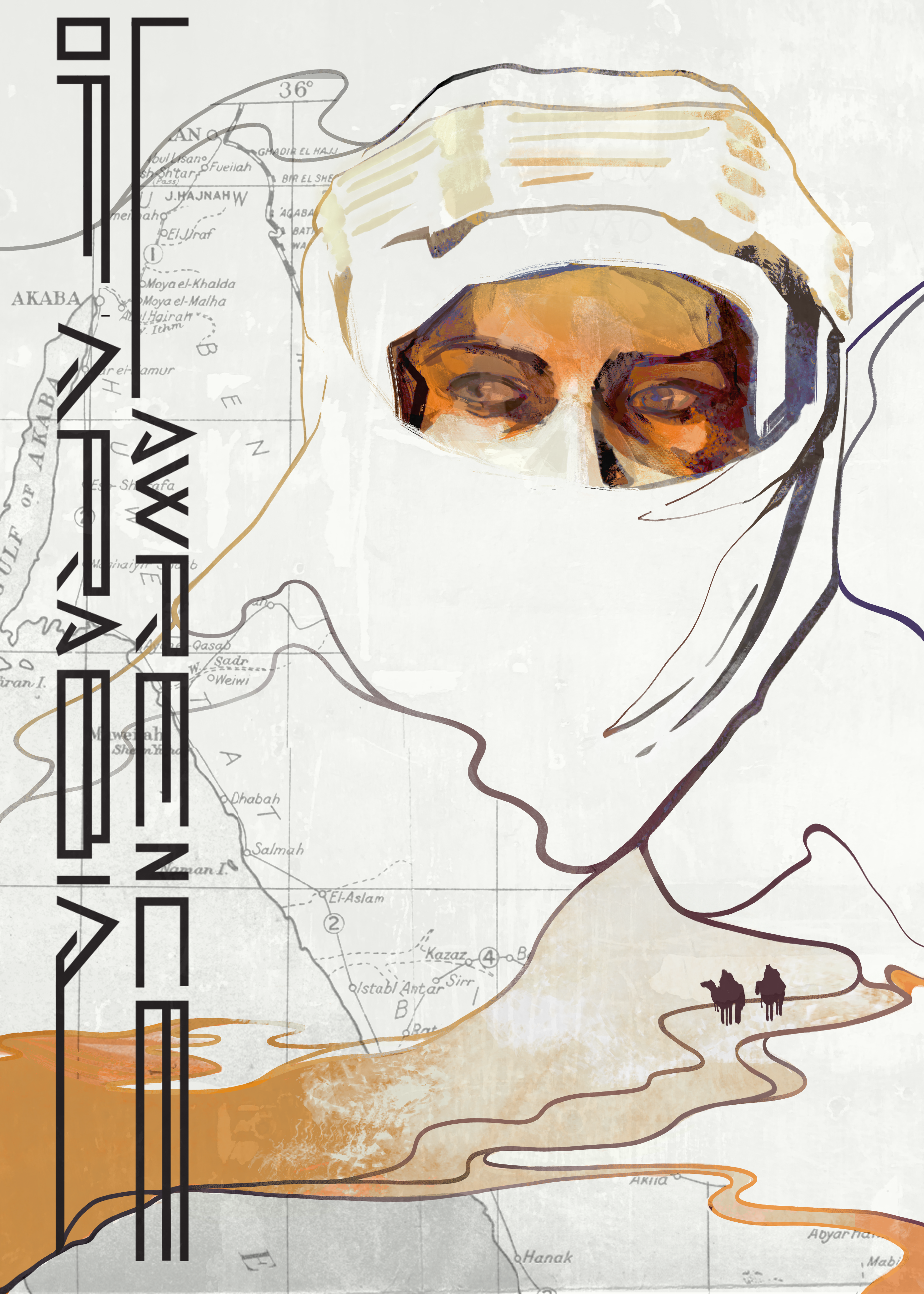
Countering the intense color from the main piece, I wanted to try playing into the original poster’s color scheme (soft, sandy beiges and warm orange tones), blending the character into the scenery to have him narratively “lose himself“ on his path through the desert to Aqaba. While fully realised and closer to original, I chose the first version as the final for it’s stronger composition and stronger dynamic evoked by color.
1_2 Poster Design – Sinjska Alka
Sinjska Alka is a traditional knightly equestrian competition held every year in Sinj at the beginning of August.
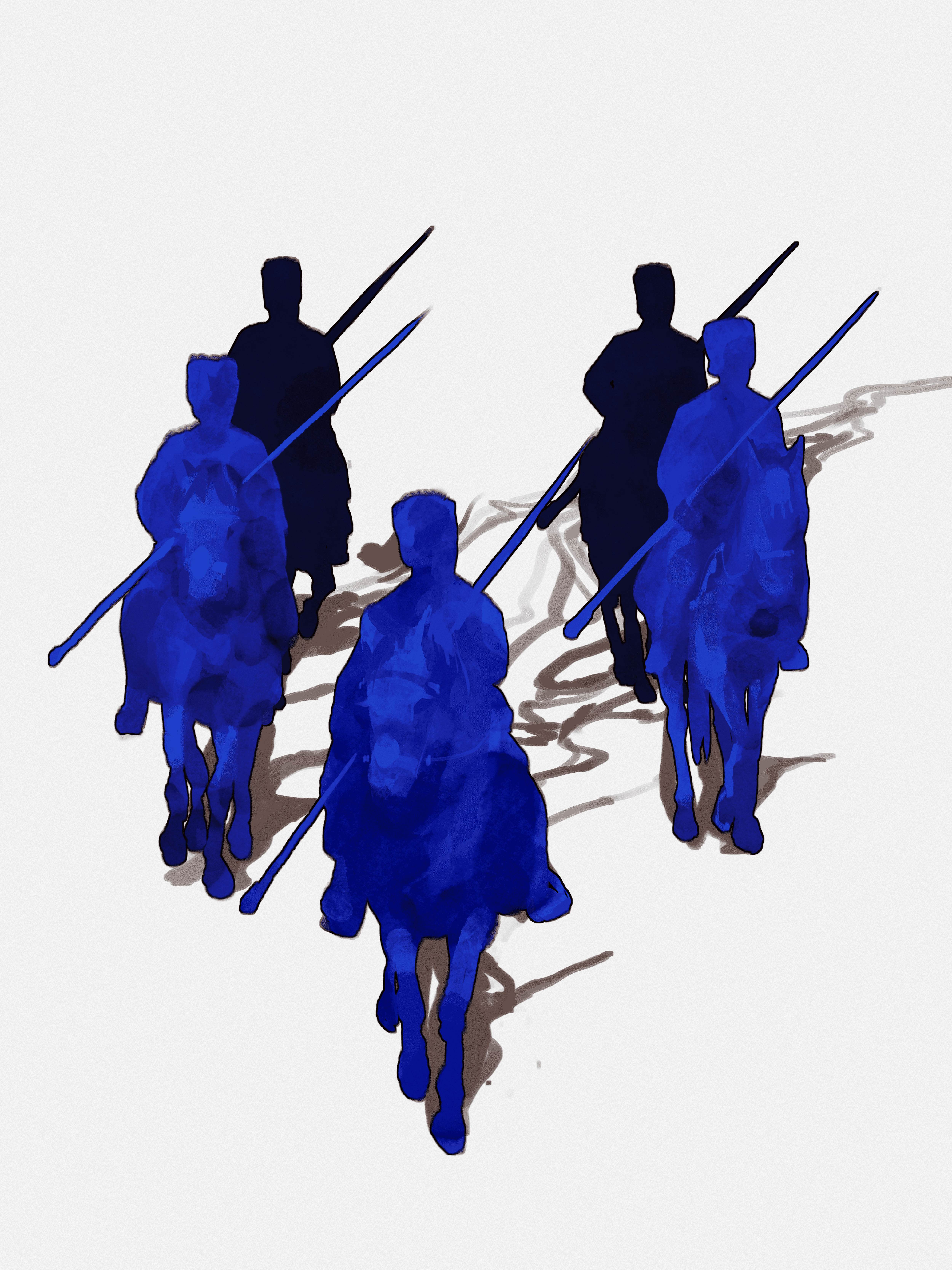
The idea was to collage my hand-drawn elements (combination of scanned aquarel painting and digital painting) into a harmony of the contemporary and the traditional. While a diagonal arrangement or a group of horsemen evokes a sense of belonging to a military unit and their community, the final choice of a centered composition emphasizes the pride of the act itself and the suspense of the new annual winner. Intense shades of red reference its accompanying bloody history, with their strong vibrancy breaking beyond the frame of the image toward the viewer, as the motive of alka crowns the galloping knight.
1_3 Poster Design – BUBA
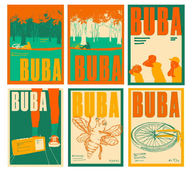
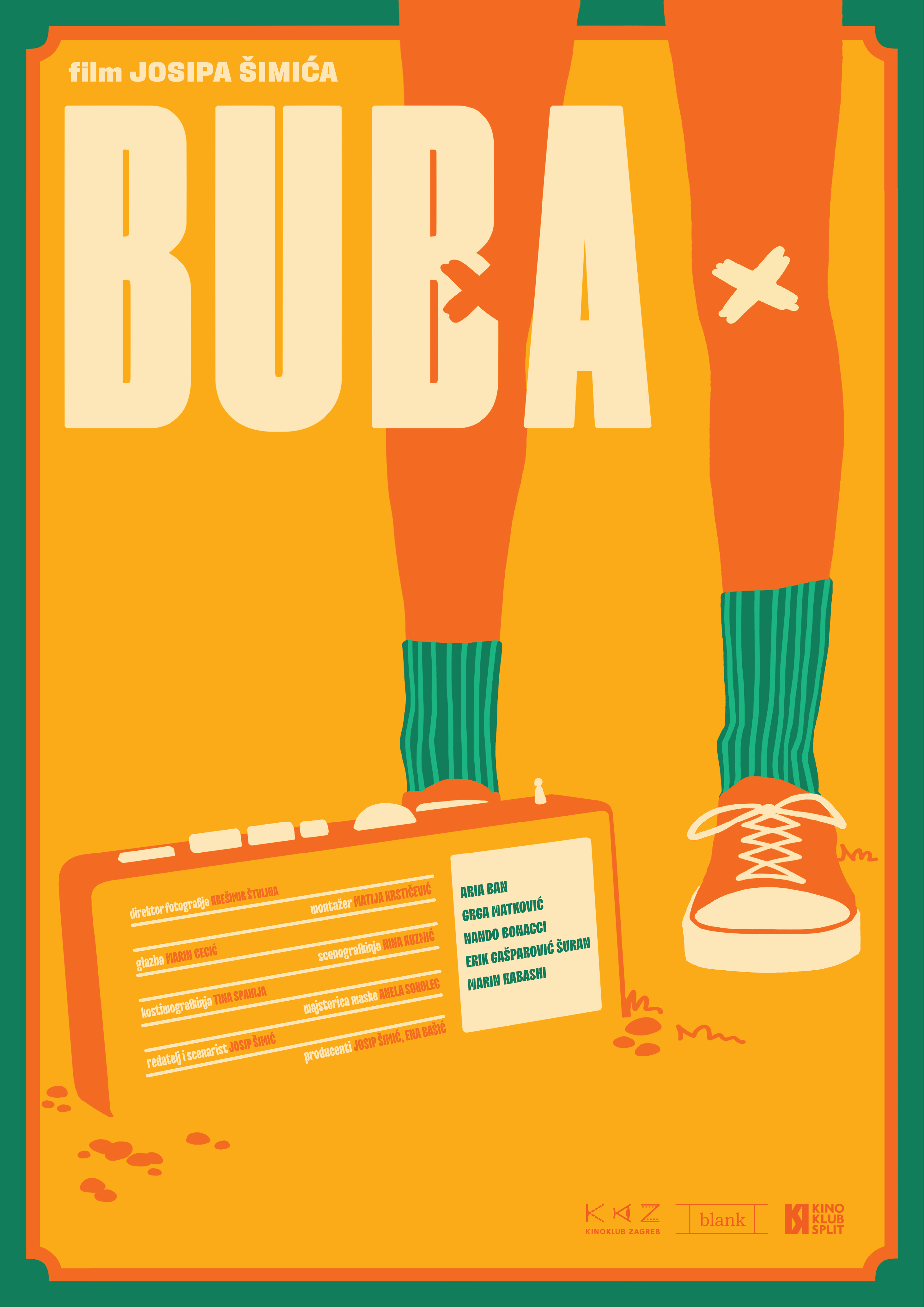
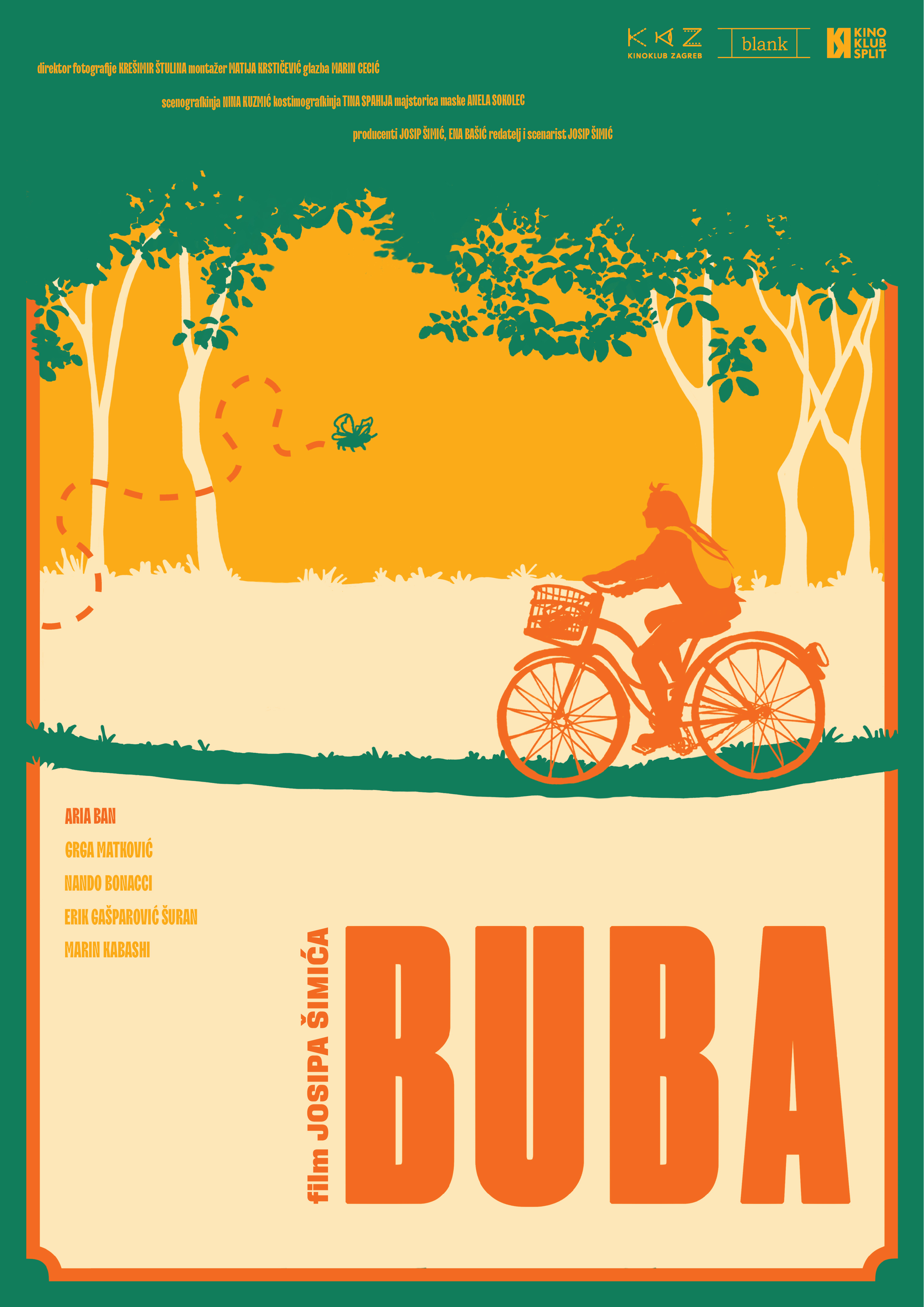
BUBA (2024.) is a silent short film by Josip Šimić.
Building on its strong retro aesthetic and limited color
palette, I created a three-poster series for its premiere.
The motifs closely follow the film’s narrative, visually
blending with its naïve, humorous identity.
Since clean, flat shapes differ from my usual style – I found it an interesting path to explore, shifting focus on utilising color accents to build composition.


2 CD cover
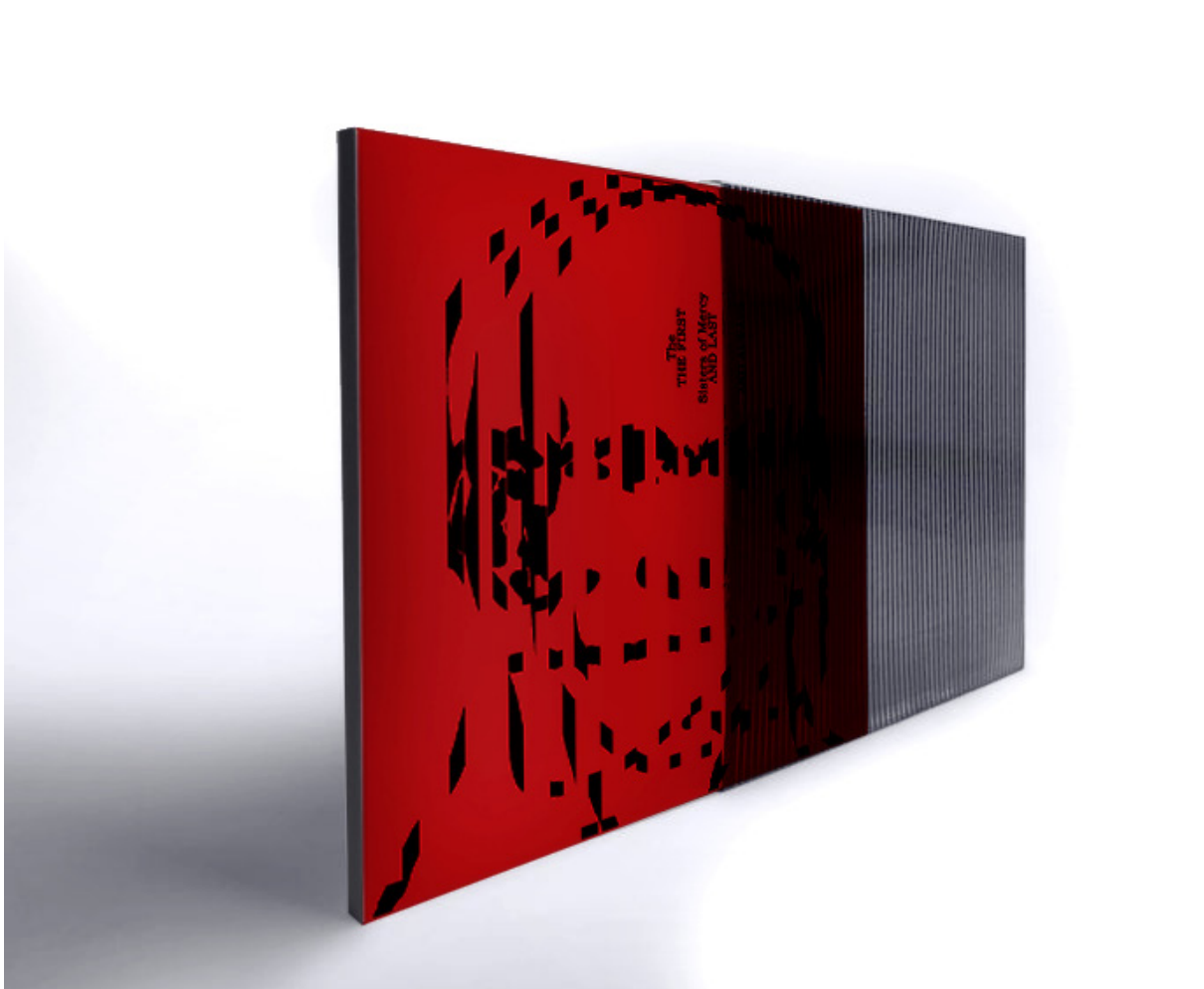
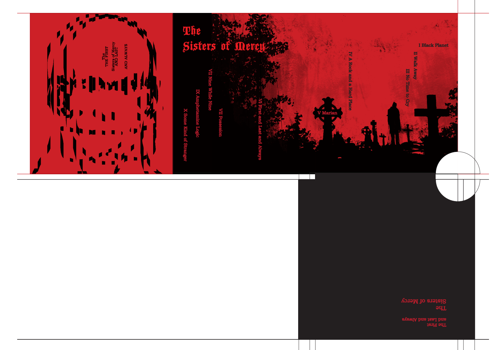
Course assignment in Graphic Technologies 2 – packaging and CD cover design for 'The First and Last and Always by The Sisters of Mercy.
The front cover is conceived as an analog animation alluding to transitional states in complexities of human relationships, reflecting the album’s lyrical themes. Sliding the semi-transparent plastic sleeve back and forth causes the figure’s head to turn and the typography to shift, revealing the band’s name and album title. The interior holds a simple illustration tying it to the gothic rock aesthetic, while the chosen color palette aligns with the band’s distinctive visual identity.

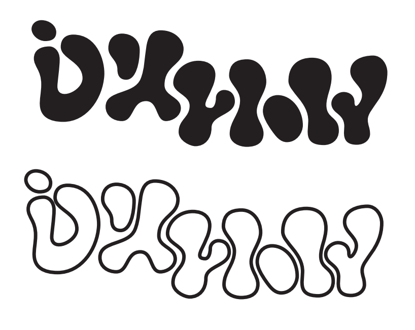
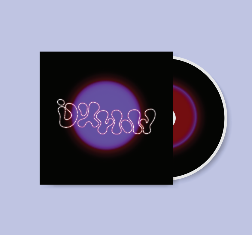
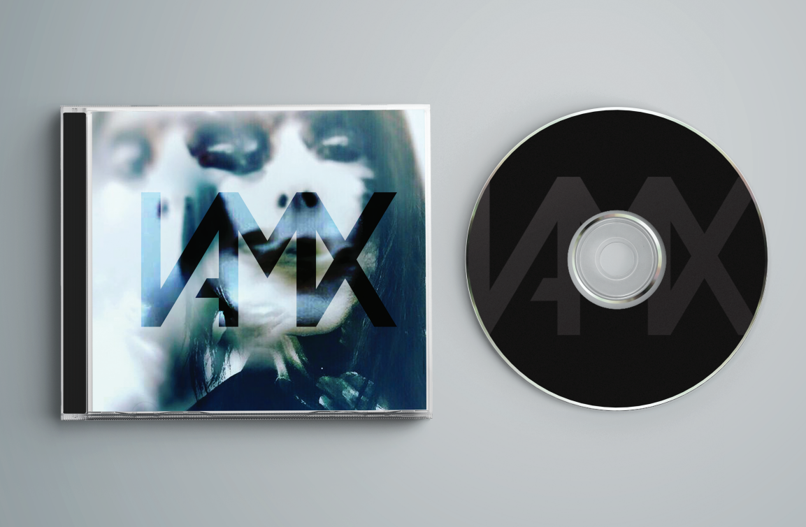
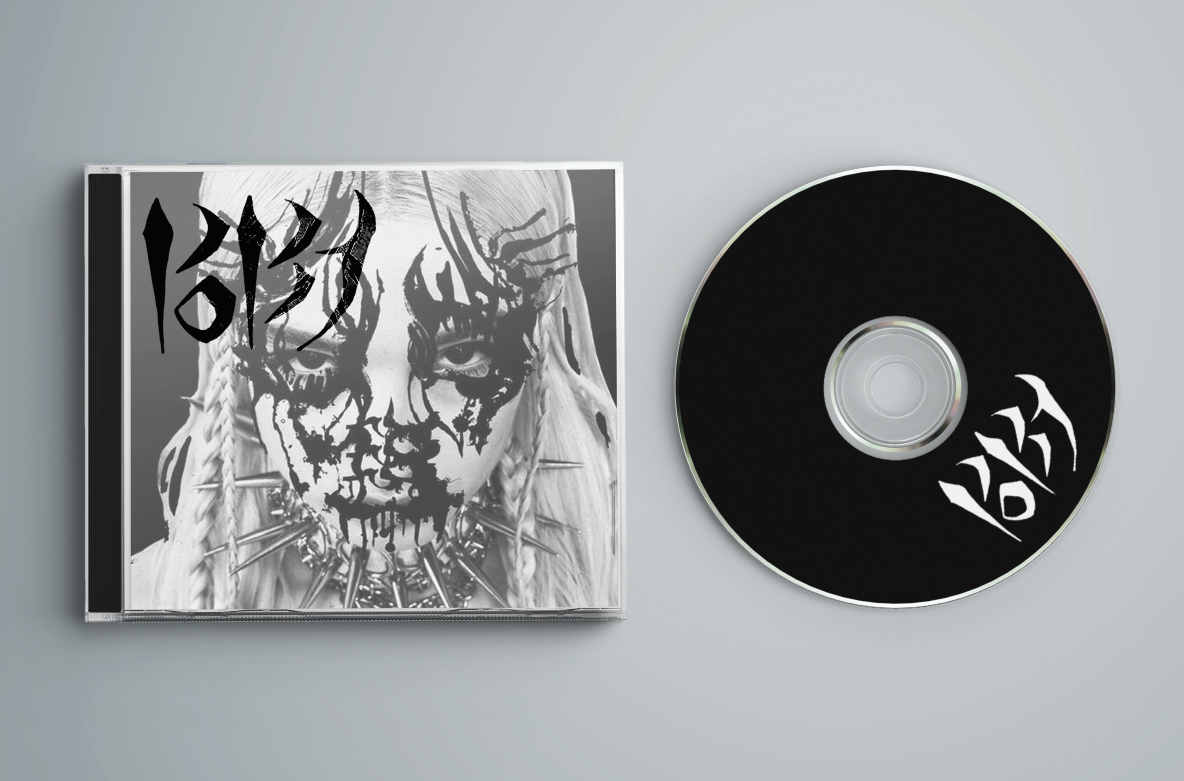
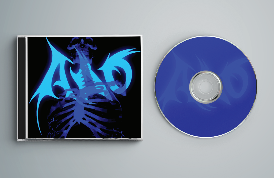
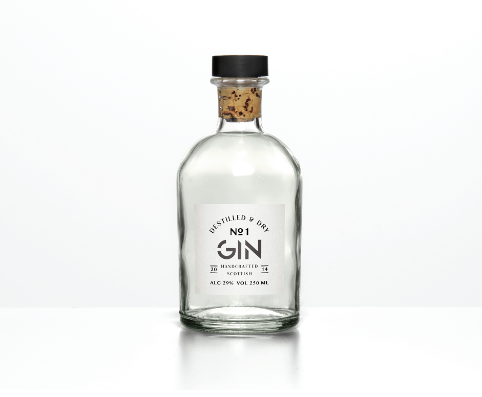
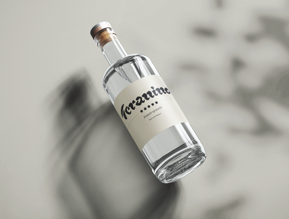
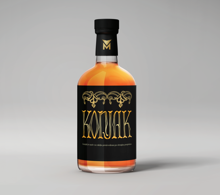
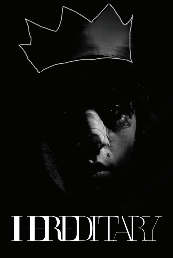
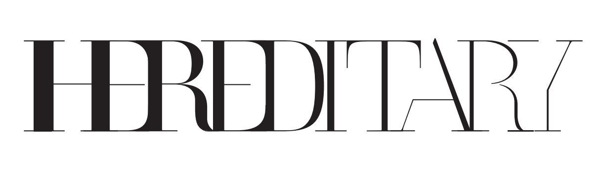
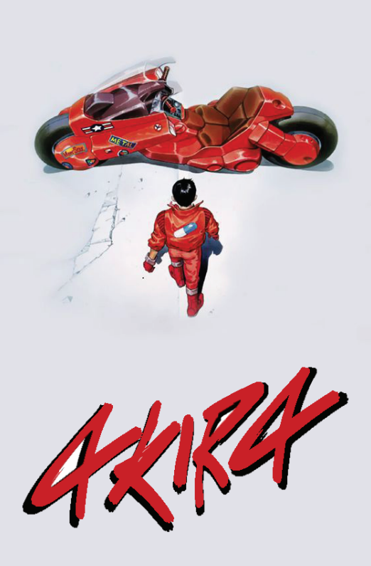
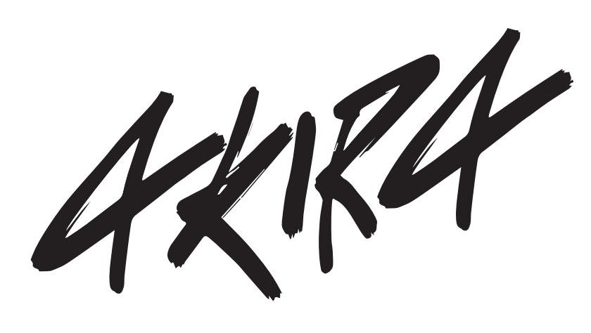
3 Lettering





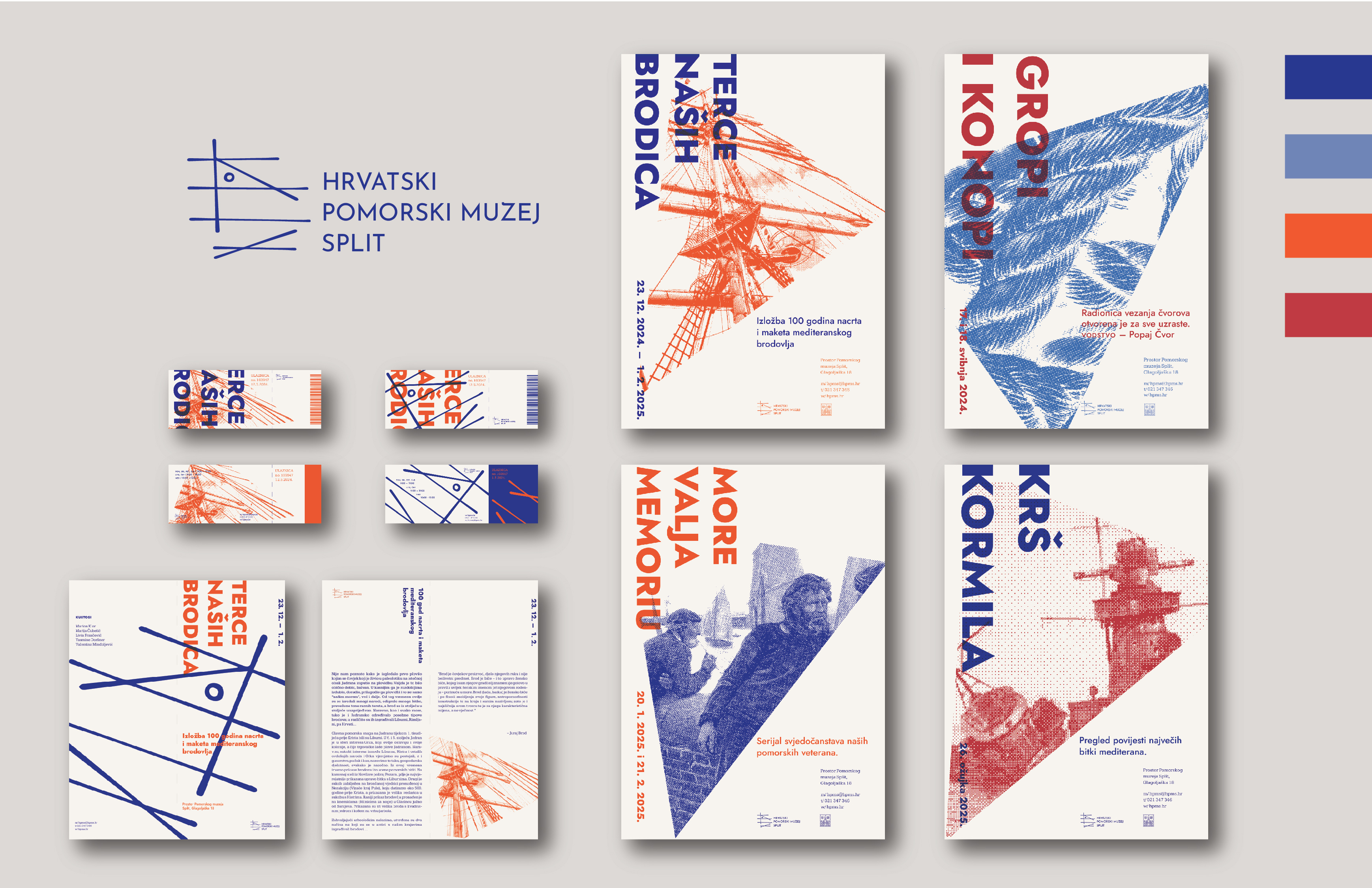
4 Visual Identity – HPMS
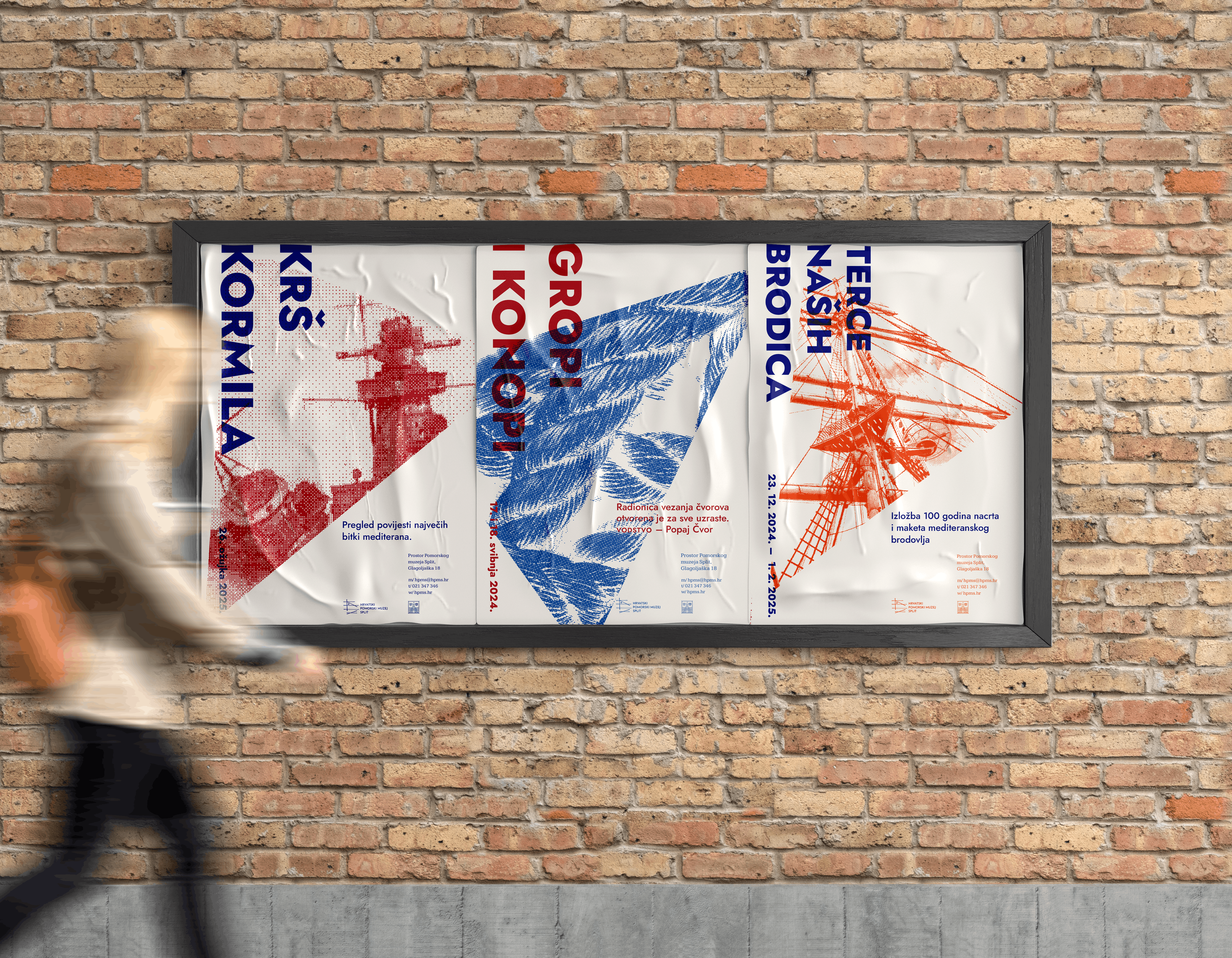
The redesign of the visual identity of HMPS (Hrvatski Pomorski Muzej Split) bases itself on the form of the logo and from it derives a system necessary for the development of other visual materials.
The side view of the museum's trademark "Bakar" ship is linearly reduced to a sketch of a technical drawing inspired by ship blueprints. A triangle derived from the same solution is used as a movable base for placing the necessary visuals, providing the possibility of the sign's own integration for stability and general applicability of the material. The choice of colors connects the vibrancy of the Mediterranean with the maritime tradition.